|
Earlier this year I had the great fortune to work with the Harmony Co-op, a thriving, local farm-to-table grocer. To understand Harmony's success, you first have to understand Bemidji. This town is a regional hub. It's located in northern Minnesota, almost equidistant between Fargo, Duluth, and Brainerd. Bemidji's economy is largely made up of small businesses, mom-and-pop shops, and other local enterprises. As is happening across the country, consumers' interest in fresh, local, and organic foods is growing exponentially, and the nearest Trader Joe's is hours away... (click 'read more' to continue) Enter the Harmony Co-op, a non-profit, cooperative grocer, founded in the 1970s. For years, it was housed in a very small downtown storefront, with tight aisles and a confusing layout. Due to some progressive leadership and some wise financial decisions, the Co-op basically outgrew that space. It moved two blocks down the street, reclaiming an old industrial building and tripling its size. Bemidji's locally-focused economy played a huge role in Harmony's success. This kind of thing doesn't usually happen in communities with a Whole Foods or Trader Joe's, so these needs are being addressed in the most socially responsible way possible -- through local business.
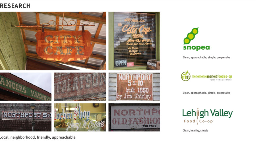
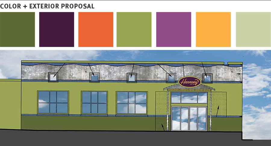
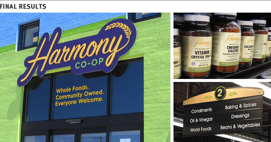
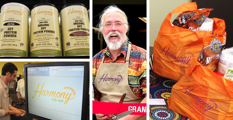
Harmony's move to this new space brought with it a desire to update and re-define its brand. One of their board members, Debbie Warne-Jacobsen, is a web designer who has collaborated with me on other projects, and invited Evensen Creative into the fold to help establish their new direction. Harmony's board of directors wanted the Co-op to be seen differently by the community. A lot of people saw it as a health food store, or a place to buy nutritional supplements. Others saw it as a hippie haven, and still others thought you had to buy a membership in order to shop there. The new brand had to bring Harmony closer to the rest of the people, and present the co-op as an upbeat, alternative grocery. One of the things I learned when meeting with the executive board was that they are extremely friendly. Especially Greg, the manager -- a ponytailed film and theater director, he's always ready to greet people with a firm handshake or a big hug (usually something in between). When you're in Greg's company, you're as close to him as anybody. Shopping at Greg's store is a lot like entering a local grocer's from a bygone era, if you consider that Greg is also a child of the 60s with a passion for modern concepts such as slow food and homebrew. This is a microcosm of Harmony's identity and their customer base: former hippies, back-to-the-landers, and old-school famers, mixed with urban farmers, vegans, slow food enthusiasts, people with dietary restrictions, and customers looking for unique or upscale food items. All of them seem to have a positive outlook and friendly disposition. To diversify this group even more, the new space also includes a deli, with daily lunch and dinner specials, and a commercial kitchen incubator, allowing Harmony to offer a production space to local foodmakers. The identity went through several rounds of revision and concept development. Ultimately, we chose a friendly script for the primary mark, due to its liveliness and vaguely retro sensibility. Gotham was selected for secondary information due to its openness and clarity. A bright, energetic color palette was selected using the annual report as a reference. The most difficult part of this process happened toward the end, as I was putting together concept after concept incorporating different elements. Wheat shafts, suns, and local landscapes all ran in and out of these concepts, and then it struck me: this store isn't complicated. Why complicate its logo? I stripped out all of the imagery, placed the wheat shaft on the end of the Y, and we were done. The final mark evokes the friendliness of a vintage, locally-owned grocer, but with a modern twist. Inside, the color scheme trends toward the more muted colors from the palette, and material choices reflect the Co-op’s reclaimed space and commitment to natural foods The building’s exterior uses more saturated colors from the palette for a warm, fun, and inviting feel -- an oasis of warmth for the depths of winter. The community has responded well to the new brand, as well as the expansion and the new location. The store's business has been steady, its deli counter serves unique and socially-responsible lunch specials on a daily basis, and the commercial kitchen is in its final stages of development. See more pictures on the Harmony Co-op case study page.
3 Comments
1/3/2012 09:24:09 pm
Yep, you got it. The building design draws the eye when driving by and is welcoming and friendly. Enjoyed how you described coming up with the Branding. You hit it so well, clear, simple, the wheat topping off the y is awesome.
Reply
Leave a Reply. |
The Blog.This is where we post news, announcements, product launches, and musings on the design process. All posts written by Erik Evensen unless otherwise noted. From the blog:Archives
April 2012
Categories
All
|


 RSS Feed